BI dashboards are essential tools for businesses, but their effectiveness largely depends on the usability of data visualisation and user experience. Discover how we can rapidly improve the effectiveness and loyalty of your dashboards with our Solution FAST DICTATION.
The importance of use value in Data Visualisation
BI dashboards have become indispensable tools for businesses looking to make informed decisions based on accurate data. However, their effectiveness depends on the trust of operational staff, analysts, and operational decision-makers in relying on the data and information. who to them presented.
The heart of user experience lies in analysing usage: we must no longer just use data, we must understand it, to give it value and meaning.
It is too often observed that data visualisation is entrusted to a technical team who carry out what the business departments (generally managers) instruct them to. This channels efforts into the «how to do it»: problems of data access and quality, and the constraints of BI tools. Questions around usage («who and why?») are neglected.
If dashboards are poorly designed, they can be difficult to understand and use, potentially leading to misinterpretations and wrong decisions, or more often, a waste of time and trust.
Common challenges in data visualisation
According to the FAST DIXIT report by JEMS, companies are experiencing recurring problems with their data visualisations.
- Lack of accessibility The design does not comply with accessibility criteria (WCAG or RGAA).
- Lack of information on data A lack of precision regarding data (sources, calculation rules, definitions, quality) breeds distrust.
- Lack of context The visualisations lack context or clear legends.
- Visual surcharge Too much information presented simultaneously makes perception confusing.
- Limited interactivity Static visualisations limit data exploration.
- Design flaws Inconsistencies in design can harm understanding and navigation.
- Poor graphical choices Certain charts can lead to incorrect or incomplete interpretations.
- Lack of personalization Users cannot customise visualisations to their specific needs.
- Uses of reports limited to consultation Often users need to use all or part of a report in a presentation (complex export process or not intended for the requested use).
Keys to improving the usability and user experience of data visualisation
1. Simplicity
Dashboards should be simple to use and understand. Users should be able to quickly find the information they need without being overwhelmed by unnecessary data. Visual clutter makes the overall perception confusing, which can hinder decision-making.
2. Personalisation
Dashboards must be customisable according to each user's needs. Users should be able to choose the data they want to view and how it is displayed. Customisation improves the relevance and usefulness of the information presented.
3. Interactivity
Dashboards should be interactive to allow users to delve deeper into the data. Static visualisations limit users« ability to »make the data talk" and gain in-depth insights. Users should be able to click on charts to get more information or filter data based on specific criteria.
4. Clarity
Dashboards should be clear and easy to read. Users should be able to quickly understand the data presented and the resulting trends. Design errors, such as inconsistent styles or misplaced labels, hinder the readability and interpretation of the data.
The FAST DIXIT solution
DIXIT QUICKLY, Suggest a quick and effective solution to improve the user experience of BI dashboards. Our approach focuses on identifying and eliminating barriers to data comprehension, modernising data representation, and the redesign of the user interface.
Steps for the FAST DIXIT Offer
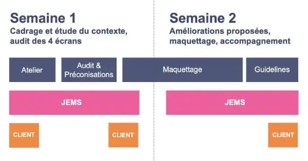
The first stage of the FAST DIXIT offering is a diagnostic. Using four key screens, JEMS reveals the necessary improvements. Deliverables include a summary note, recommendations, redesigned screens, and support for technical teams.
The first week is dedicated to framing and studying the context, as well as auditing the four selected screens. During this period, the JEMS team conducts an in-depth analysis of the screens to identify weaknesses and opportunities for improvement.
The second week is dedicated to proposed improvements. This includes mock-ups of the new designs and confirmation that the proposals meet the specific user needs. The JEMS team then presents its recommendations and mock-ups for validation.
Finally, JEMS supports its clients in implementing improvements. This support includes a handover workshop and recommendations for the technical teams, including IT services, data visualisation services, data analysts and data engineers.
Conclusion: focus on use value in Data Visualisation
Our design and data visualisation experts enhance your data storytelling with a method based on User-centred creation of use value.
Improving data visualisation is a crucial investment for any company looking to optimise its data-driven decision-making. Thanks to FAST DIXIT, JEMS offers a quick and effective solution to transform your BI dashboards into powerful and intuitive decision-making tools.
An image doesn't speak, it tells a story.
Data storytelling transforms data into a clear, coherent, and meaningful narrative. It transforms the rational into the emotional.