A brand must evolve and maintain its positioning. At the start of 2022, we are delighted to present our new logo. A choice that remains simple and legible, built on our three pillars – Create, manage, operate – and that retains the originality of our colour!
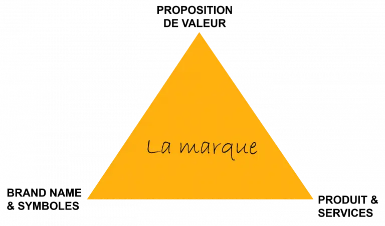
A brand represents the combination of three elements: its value proposition, meaning what we sell, to whom we sell it, and why we sell it, its services or products, and finally, its brand identity.
These three elements represent a living system that balances itself. In marketing, we know this concept well, which is called the brand triangle.
When we modify an element, such as the offer or the positioning, it is necessary to re-establish the balance. It is therefore only natural to evolve our visual identity.
«A company's value is now data» is a statement that is heard more and more often. However, an organisation's value is far from being limited to this single aspect...
Is a new identity a break?
Let's revisit our president's words here:
«JEMS is a data industrialist. This positioning is unique in the market. This change of identity is not a break, but a continuation of our fundamentals.»
So, no, it's not a break. In a brand identity, the logotype remains the most visible element. We've therefore chosen a proposal that remains faithful to our values, to our way of being:
- Commitment With this logo, we are translating our desire to open up new territories, always with our know-how and our ethos. Our commitment to our clients, partners and collaborators remains intact.
- Diversity it was important for us to listen to everyone's opinions, and we took everyone's views within the company into account through a survey. Because JEMS is not a siloed company;
- Agility JEMS has always adopted an agile approach to meeting client needs. This is reflected in its very flexible format;
- Audacity The graphic choice is simple and effective, but it remains unique with a very human, warm colour palette that corresponds well with our approach.
The genesis of the project
Following recognised market expertise and a good reputation, we felt our image was no longer in line with our positioning and ambitions.
Working with the agency LMWR, who supported us, we wanted to both illustrate our expertise as’Data architect (advising on and organising customer data management), our vocational expertise very strong in many areas of data (predictive data modelling, cloud migration, data visualisation, IT system change, data platform approach, etc.) and especially Industrial (duplicate proven processes for successful projects within budget and time constraints) from the Data.
The challenge was therefore up to par and we are proud of the result: