On the one hand, ideation, group work, and friendly workshops to seek inspiring ideas. On the other, functional dashboards to make the right decisions. Two key areas of expertise for launching new services, but they don't speak the same language. What if we combined the two? That's our entire value proposition in dataviz.
An offer that creates innovative dashboards
At JEMS, we've been convinced for years that the contribution of lean UX is not limited to the deployment of specific web and mobile applications. Service design is an accelerator for the development of our data visualisation solutions and central guaranteeand’end-user adoption. We have created a packaged offer for data visualisation application development based on an approach user-centric and Design thinking.
We design and then industrialise innovative dashboards integrating actionable data storytelling at JEMS in service centre mode. This offering is called Digital X-ray Image Transmission.DiXiT is the acronym for Data Intelligence Experienced Interactive Technology.
User experience is central to the data visualisation approach. The data heritage must be transcribed in an intelligible way to everyone, graphically represented with a design that aids understanding, rapid analysis, and decision-making.
Our value proposition in dataviz
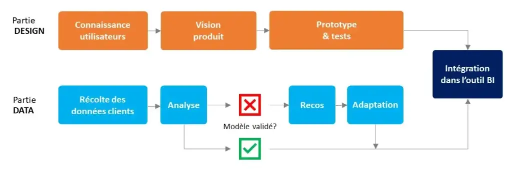
The support that JEMS offers takes place over several stages. Firstly, we begin by thoroughly understanding the need through interviews to define the scope. Then, we collaboratively build an interactive prototype with real data, from which data model recommendations emerge to properly launch industrialisation. Finally, we train the users and transfer skills.
We are organising workshops to ensure the smooth running of the application's design and development. This is done partly through project management: kick-off, progress review meetings, steering committee meetings. On the other hand, through activities such as sketching workshops or user testing.
An innovative approach for real added value
Our approach systematically starts with our clients' concrete needs:
- Bringing touches of modernity to their applications: visual hierarchy, contextualisation, combinations, one-page content; ;
- Improving user services: ergonomics, clarity, reducing representation bias; ;
- Replacement of an aging existing system ;
- Optimise the provision of data visualisation applications.
In less than two weeks, we simulate a vision of the finished product and deploy an industrialisation approach. A significant amount of time saved.
To find out more
Discover our client case studies
- Coface Redesign of the monitoring tool using data and design for the credit insurer
- PQH Holding A prototype for a data visualisation for the packaging subsidiary
Watch our video clip
- YouTube Dixit is an offering that combines user experience, design, and data storytelling.